Explorations of Time Series Analysis Techniques and Forecasting Methods on Real-World Applications

Literature Reviews

My semester project focuses on exploring time series analysis using ARIMA/SARIMA and Bayesian models to forecast and analyze the spread of COVID-19 and CO₂ emissions in Mauna Loa, Hawaii. Below are the literature reviews I have completed, highlighting the methods and techniques applied in my research.

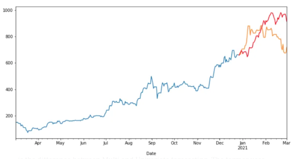
Time Series Forecast

Source: An Introduction to Time Series Analysis with ARIMA, Towards Data Science

Abstract

This study explores time series forecasting techniques using ARIMA, SARIMA, and Bayesian Structural Time Series (BSTS) models on two distinct datasets: the COVID-19 dataset from the Johns Hopkins CSSEGISandData repository and the CO₂ emissions data from Mauna Loa, Hawaii, provided by NOAA. The primary objective is to apply machine learning techniques to predict future data patterns and to evaluate the efficiency of each model, comparing their performance against each other For large datasets, such as COVID-19, both ARIMA and SARIMA models demonstrated rapid processing capabilities; however, SARIMA introduced additional noise due to explicit seasonality, impacting accuracy. Both models produced forecasts with higher variability and were outperformed by the BSTS model, which demonstrated lower Root Mean Squared Error (RMSE) and Hold-Out Mean Absolute Percentage Error (MAPE) but with greater computational complexity causing slower processing time.

In contrast, the smaller Mauna Loa CO₂ dataset, characterized by smoother seasonal patterns, allowed for more precise forecasting. Among the tested models, the BSTS model achieved the highest accuracy with an RMSE of 0.765 and a MAPE of 0.161%, outperforming ARIMA and SARIMA, which had RMSE values of 12.55 and 13.38, respectively. This analysis highlights the effectiveness of the BSTS model for stable, seasonally predictable datasets, while ARIMA-based models may struggle with complex, volatile data like the COVID-19 dataset. These findings underscore the importance of selecting models that align with the dataset’s characteristics to optimize forecasting accuracy.

Introduction

Anything that is observed sequentially over time is a time series. In the data, I will look at regular intervals of time. Time series forecasting is a statistical method used to predict future values based on past results. The simplest models focus solely on the variable being forecast, ignoring external factors like marketing efforts or economic shifts, and instead extrapolating existing trends and seasonality. Specifically in this capstone, I will be exploring univariate models ARIMA/SARIMA and the Bayesian STS.

The use of time series analysis gained recognition since 1970 when the Box-Jenkins method popularized ARIMA models to find the best fit of different time series models based on past data. However, the concept of analyzing sequential data over time is not new. As the world increasingly embraces data-driven solutions to forecast future industry outcomes, time series analysis has become vital in numerous fields.

Currently, efforts to perfect the science of forecasting is important as the higher the accuracy of a time series based on past data and events, the more essential the tool becomes for modern organizations as accurate forecasts support decision-making across various timeframes—whether short-term, medium-term, or long-term, depending on the specific application. Key considerations in forecasting include seasonality, trends, and external fluctuations, which play a significant role in shaping predictions. These specifically will be explored more as I deal with the data sets of this project. These forecasts are integral for planning, resource allocation, and adjusting strategies in response to upcoming movements.

The main goal of my paper is to explore and discuss the concept and use real life datasets in order to see how time series analysis can use its historical data and leverage practical and meaningful conclusions. In this paper, we will also be discussing any possible limitations that the different time series models have and what some suggestions are to improve our predictions and possibly overcome these limitations.

In this capstone, I will explore the Johns Hopkins CSSEGISandData COVID-19 Repository, which tracks global COVID-19 cases and Our World in Data (OWID), which provides comprehensive COVID-19 datasets across various indicators datasets to test the univariate models ARIMA/SARIMA and Bayesian STS. Using the same model structures, I will also be exploring the Forecasting CO₂ Emissions in Mauna Loa, Hawaii. This dataset is provided by the Global Monitoring Laboratory within NOAA. The goal of this exploration is to apply time series analysis to forecast the future spread of COVID-19, seeing which models are the strongest to do such a task, and to use those same models to appropriately forecast the increasing trend of the CO₂ emission rates. These two different datasets and applications are to show the strength in forecasting in multiple real-life situations. This is important in data science and statistics, particularly in public health and global policy as creating accurate forecasts can allow policymakers a better direction on what should be applied and when.

To achieve the goals of my capstone, ARIMA/SARIMA will be used for capturing linear trends and seasonal effects, and Bayesian STS for incorporating uncertainty and providing probabilistic forecasts. The project will begin with an exploratory data analysis (EDA) to visualize the time series data, identify patterns, and check for seasonality or trends. After cleaning and preprocessing the data, I will test both models using Python on the COVID-19 and CO₂ datasets. The results will then be compared to assess which approach yields the most accurate and insightful forecasts.

Time Series Forecasting Models

In different papers and studies, it is easy to see that there are a multitude of models to explore and chose from, depending on what is being questioned or asked from by the researcher and data. Most of the models can be seen following into different categories. Traditional statistical modeling, which includes a moving average, exponential smoothing, and autoregressive (ARIMA). These are seen as linear functions taking past observations to make sound predictions. Second category of model type is nonlinear models. This will not be covered in my project, but the main difference lies in the complexity and non-proportional relationships in the data. An example of this can be LSTM, ANN, NAR models. The second main model type that I will be covering is the Bayesian Structural Time Series (BSTS). This model type is considered linear, since it relies on the state-space models, but can handle much more complexity such as trend, seasonality, and regression components. So, although it is linear, the approach is more flexible by adding prior distributions allowing for uncertainty estimations. In this capstone, these two ARIMA/SARIMA and Bayesian STS will be explore in depth.

ARIMA Model

To begin, throughout this project I will be utilizing the ARIMA model as a traditional method of time series forecasting. ARIMA stands for Autoregressive integrated moving average and it predicts future values with past values. It utilizes lagged moving averages to smooth the time series data. The ARIMA model is a univariate model that can be broken down into two different models, AR and MA, which will be define below.

The ARIMA model is defined by the parameters \( (p, d, q) \), where:

The ARIMA model is composed of two submodels, the AR (Autoregressive) and the MA (Moving Average) model, described mathematically as follows:

\[Y(AR)_t = \alpha + \beta_1 Y(AR)_{t-1} + \beta_2 Y(AR)_{t-2} + \cdots + \beta_p Y(AR)_{t-p}\] (1)

where \( Y(AR)_t \) are the lags of the series, \( \beta \) are the lag coefficients estimated by the model, and \( \alpha \) is the model’s intercept term.

\[Y(MA)_t = \epsilon_t + \theta_1 \epsilon_{t-1} + \theta_2 \epsilon_{t-2} + \cdots + \theta_q \epsilon_{t-q}\] (2)

where \( Y(MA)_t \) depends only on the lagged forecast errors, \( \theta \) are the parameters of the model, and \( \epsilon \) are unrelated error terms.

The mathematical expression of the ARIMA model, as a combination of AR and MA models, is:

\[Y_t = \alpha + \sum_{i=1}^{p} \beta_i Y_{t-i} + \epsilon_t - \sum_{j=1}^{q} \theta_j \epsilon_{t-j}\] (3)

Where \( Y_t \) and \( \epsilon_t \) represent the time series and the random error at time \( t \), \( \beta \) and \( \theta \) are the coefficients of the model.

When estimating the \( p\) and \( q\) parameters of the AR and the MA models, plots from the ACF function and the PACF functions are used. Just to summarize, the autocorrelation function, ACF, is a function that shows the correlation between the observed of the \(t \) time and the observation at the previous times. This function indicates the autocorrelation coefficient, which is the measurement of the correlation between observations at different times. PACF, or partial autocorrelation function differs because it is the correlation between two random variables after the influence of confounding variable is removed [7].
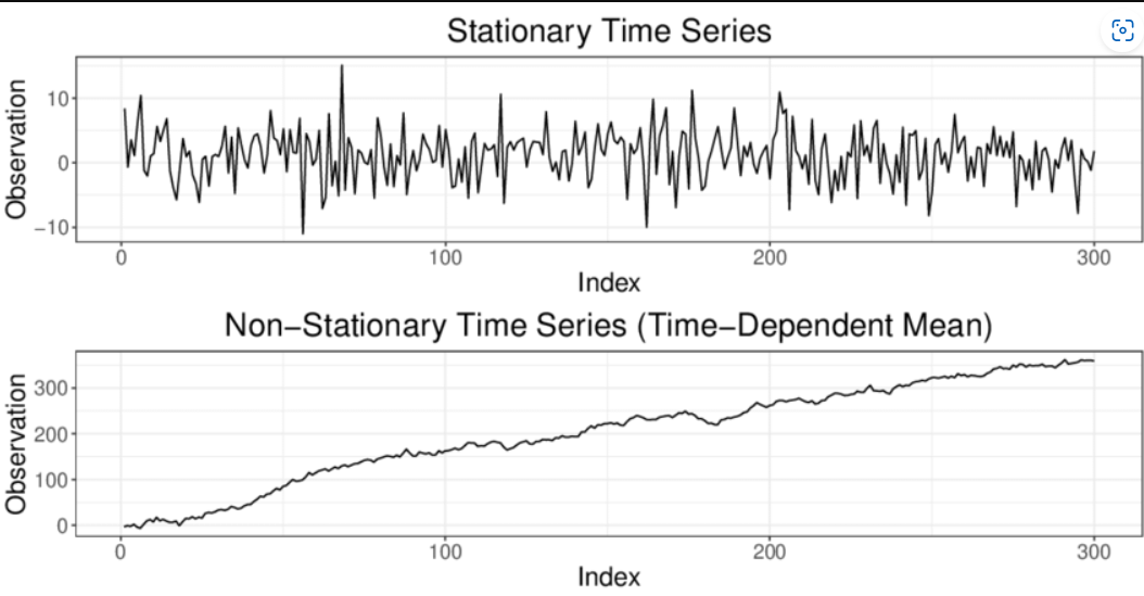
Stationary_Example

Source: Classification of Time Series

Prior to finding the ACF/PACF, it is obligated for us to know if the data that is obtained is stationary or nonstationary. This is important because if the data is not stationary, the data cannot perform the ARIMA model accurately. Therefore, in order to determine if the model is stationary, it can be visualized or the Dickey-Fuller Test can be performed to determine the classification of the time series data.

When differencing is applied and observed, the \(p\) order deals with the AR model and it is based on the significant spikes from the PACF plot. The MA model, \(q\) order is determined if the ACF plots have sharp cut-off after lags. If there has been any differencing applied to the model, \(d\) is determined by the order of the differencing (i.e. how many times the differencing has been applied).

After the strongest combination of the \( (p, d, q) \) have been selected, it is possible to then run the ARIMA model and see the results. At times, it can be difficult to physically pick out the correct combination. If this becomes the case, there are machine learning approaches to choose the appropriate orders.

Bayesian Structural Time Series Model

Fundamentally, this theorem is unique from ARIMA due to differences in the interpretation of what “probability” means. We will explore criticisms later, but it is important to remember this distinction when understanding the model differences. Bayesian inference is a method of statistical inference where available knowledge about parameters in a statistical model is updated with information from observed data. A Guide to Bayesian Inference.

Bayesian inference provides a powerful framework to update beliefs as new data becomes available. It allows us to calculate the probability of an event occurring, given prior knowledge and new evidence. A simplified version of Bayes’ theorem looks like this:
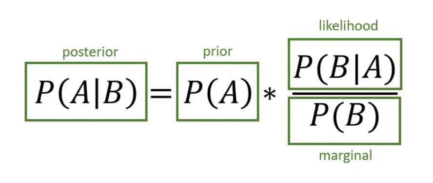
Bayes' Theorem Visualization

Bayesian Time Series Forecasting

Referring to the image explaining the visualization, it breaks down the components as follows:

This framework is fundamental in Bayesian time series analysis, allowing models to update predictions as new data arrives. The posterior distribution represents the estimation of a parameter, ensuring the model reflects both the past trends and the latest observations.

Source: Created based on Bayes' theorem principles, adapted for better interpretability.

Now, for Bayesian Structural Time-Series Models, the time series can be broken down into four basic models depending on the following: a level, a local trend, seasonal impacts, and an error term. Structural Time Series models can be defined by the following:

\[ y_t = Z_t^T \alpha_t + \varepsilon_t \]
(4)
\[ \alpha_{t+1} = T_t \alpha_t + R_t \eta_t \]
(5)

Equation (4) and Equation (5) represent the structure of the model. Equation (4) is trying to understand the distribution of the \( Y_t \)’s of the data, while Equation (5) is closely related to understanding the distribution of the parameters. It provides the evolution model for the parameters and how they change over time. Because the vector evolves through randomness, it describes the distribution of the hidden parameters at the next step. This is crucial because for Bayesian inference to hold, updating the beliefs of the parameters helps incorporate both the priors and the observed data.

Criticism and Limitations

The key distinction between the ARIMA and Bayesian methods lies in their underlying theoretical perspectives: frequentist vs. Bayesian. In the frequentist approach (as used in ARIMA models), parameters are treated as fixed values that do not change once estimated. The data is analyzed under the assumption that these parameters have unique, fixed points.

In contrast, the Bayesian approach views parameters as random variables that can evolve over time, with uncertainty captured through prior distributions. This flexibility allows the Bayesian method to incorporate prior knowledge about the parameter’s movement and update these beliefs as new data becomes available, resulting in what is known as posterior distributions.

This difference introduces a potential limitation: if the prior distribution is inaccurate or misinformed, it can negatively affect the model’s output. While prior information can enhance predictions, it can also become a burden if the assumptions are flawed or if prior knowledge conflicts with new observations. Therefore, Bayesian models offer both advantages and risks: they excel when reliable prior knowledge is available but can be inaccurate if the priors introduce bias into the model.

Next, time series analysis inherently faces criticism because it attempts to predict the future—data that has not yet materialized—with as much certainty as possible. When practicing time series forecasting, it is crucial to not only critique the model’s inference but also incorporate evaluation methods into the decision-making process, given the inherent uncertainty of projections.

While cross-validation techniques are still applicable and recommended for time series models, specific approaches such as leave-one-out (LOO) cross-validation can pose challenges. For time series, LOO can be problematic when the goal is to estimate predictive performance for future time points, as removing an observation disrupts the temporal dependencies in the data. This is particularly problematic from a Bayesian perspective, where each time point informs the next. Ignoring these dependencies undermines the theoretical foundation of time series models, which rely on the structure of sequential observations.
Methods

My project explores time series forecasting using two distinct datasets: one focused on COVID-19 case trends and the other on the NOAA Mauna Loa CO₂ emission dataset. I will apply my forecasting models to both datasets and evaluate their predictive performance. The models’ strengths will be compared across the two datasets to assess their ability to capture different patterns and trends. Finally, I will generate a summary detailing the strengths, weaknesses, and limitations encountered throughout the project.

Johns Hopkins COVID-19 Exploration

This part of the project uses time series forecasting on the COVID-19 dataset from the Johns Hopkins CSSEGISandData, with an emphasis on modeling the data using ARIMA/SARIMA and Bayesian Structural Time Series (BSTS). Both are univariate (single-variable) time series methods without trend or seasonal components, while other time series models, such as SARIMA, can capture multivariate series with trends and seasonal patterns. Within this capstone, I will demonstrate how the predictions appear when forecasted using ARIMA, SARIMA, and BSTS. Then, I will compare the results, determine which model is best suited for the COVID-19 dataset, and revisit the limitations of the models based on the outcomes of their applications.

First, the data will be loaded into JupyterNotebook and processed with Python. Then, the data is already cleaned through the github repository CSSEGISandData.

Using Python, the key libraries utilized for processing my ARIMA model were Pandas, Matplotlib, and Statsmodels. I used Pandas extensively for data manipulation, including loading the dataset, converting date columns to datetime format, applying differencing to achieve stationarity, and other data preparation tasks. Matplotlib was instrumental in visualizing the time series, including plotting the original and differenced data, as well as visualizing the autocorrelation and forecast results. Statsmodels was used to fit the ARIMA model and provided essential tools for analyzing time series properties, such as plotting the partial autocorrelation function (PACF) and autocorrelation function (ACF), as well as fitting the model itself to make predictions.

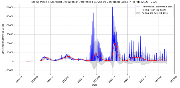
To begin the data exploration, I processed the data from the Johns Hopkins dataset. The dataset was already prepared, cleaned, and organized by country, province, state, date, confirmed cases, and more. After loading the dataset into JupyterNotebook, I examined its structure and content. To explore the dataset further, I applied a rolling statistic. This approach visualizes a moving window along the time series, which is particularly useful with ARIMA as it helps to observe moving averages. These rolling averages smooth out short-term fluctuations, providing a clearer view of the underlying trends in the data.

ARIMA and SARIMA Forecasts

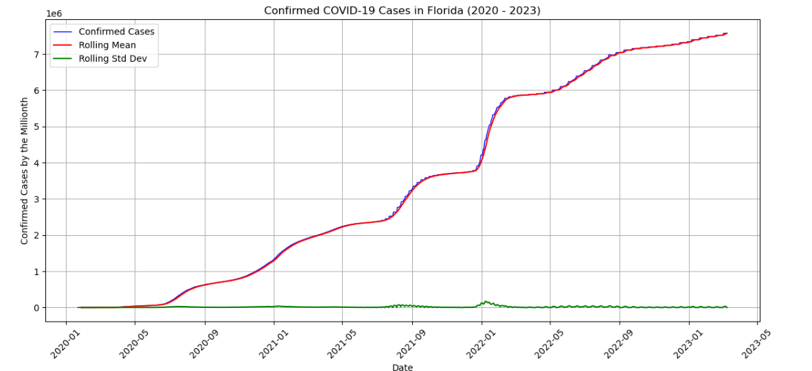
Rolling_Mean_STD
 
rolling_mean_us = us_data['Confirmed'].rolling(window=30).mean()
rolling_std_us = us_data['Confirmed'].rolling(window=30).std()

Rolling Mean and Rolling Standard Deviation over 7-day periods, showing the trend of confirmed COVID-19 cases in Florida (2020-2023).

After creating a line graph displaying the trend of confirmed COVID-19 cases over time, it became clear that the volume of data required narrowing down the location or focus. I chose to concentrate on Florida, my home state. Then, I noticed that the data exhibited seasonality, with confirmed cases rising as the weeks progressed. I began by processing the Johns Hopkins dataset, which was already organized by country, state, and confirmed cases, among other variables. I ensured all date and time variables were correctly formatted, addressing any missing values along the way. I plotted a general USA COVID-19 graph to analyze the structure, which revealed a positive trend and signs of seasonality.

First, to point out the code, the cleaned data set allows me to calculate the means with ease. I used a window of 30 days for both the means and standard deviation. Then, as it can be seen, the blue line of confirmed cases, or the cumulative data has small rigidness on the line. When the rolling mean was applied, it smoothed out the curve based on the 7-day rolling window. This averages out the daily changes to the data over a week at a time. Because the changes of the window size is low, the standard deviation line in green will appear low, indicating that the variations over that period are not significant. All this is applicable to our data as the nature of COVID-19’s spread tends to increase in a consistent matter over time, except as we can see in 2022-01, we had a significant spike. Aside from that, the rolling standard deviation proves that there is lower variability.

As I am exploring and graphing the data, I made sure that the date and time variables were all formatted correctly and cleaned up any empty values. Then, I begin the ARIMA process. Visually, the data appears to be stationary. This can be determined by the characteristics that it is trending upwards and has some sort of seasonality since there is a pattern within the upward trend that appears to be relatively consistent. However, if I want to make sure I will approach by applying the Dickey-Fuller hypothesis testing.


print('Results of Dickey-Fuller Test:')
dftest = adfuller(us_data['Confirmed'], autolag='AIC')
dfoutput = pd.Series(dftest[0:4], index=['Test Statistic', 'p-value', '# Lags Used', 'Number of Observations Used'])
for key, value in dftest[4].items():
  

This code allows us to test the ADF hypothesis. The outcome of this was that my p-value was greater than 0.05, so we fail to reject the null hypothesis, and therefore perform a first order differencing on the model.


fl_data = cleaned_data[(cleaned_data['Country_Region'] == 'US') & (cleaned_data['Province_State'] == 'Florida')].copy()
fl_data['Last_Update'] = pd.to_datetime(fl_data['Last_Update'], errors='coerce')
fl_data = fl_data.dropna(subset=['Last_Update', 'Confirmed'])
fl_data['Confirmed'] = pd.to_numeric(fl_data['Confirmed'], errors='coerce')
fl_data = fl_data.groupby('Last_Update')['Confirmed'].sum().reset_index()
fl_data = fl_data.sort_values('Last_Update')
fl_data.set_index('Last_Update', inplace=True)
fl_data['Differenced_Confirmed'] = fl_data['Confirmed'].diff()
fl_data.dropna(subset=['Differenced_Confirmed'], inplace=True)

So, I specifically am attempting to apply stationarity to the Florida COVID data, which is seen with the Country Region and State being Florida. Then, after doing data cleaning to structure the data in preparation of stationarization, I apply the differencing to the data. Which is then seen to be stationary under this hypothesis. Since this has now confirmed that the data is stationary, a first order differencing is now necessary to continue.

After the data is differenced, I performed the ADF again, and this time the p-value was less than 0.05. Therefore, the process can continue.

Differenced COVID-19 Data

Now, from here it is possible to choose an ideal model from the PACF/ACF models, but I used the ARIMA Order Select AIC function that is found in the statsmodels.tsa.stattools package. The reason I decided to do this instead of looking at the PACF/ACF was because of the variability within those graphs, I believe that using this tool lets me be more efficient and also more accurate since if I chose, I could have human error.


from statsmodels.tsa.stattools import arma_order_select_ic
order_selection = arma_order_select_ic(fl_data['Differenced_Confirmed'].dropna(), ic='aic', max_ar=5, max_ma=5)
print(order_selection.aic_min_order)

From this code, I achieved the following ARIMA order = (5,0,5). Then, I used this to fit my ARIMA model.


model = ARIMA(fl_data['Differenced_Confirmed'].dropna(), order=(5, 0, 5))
fit_arima = model.fit()
print(fit_arima.summary())
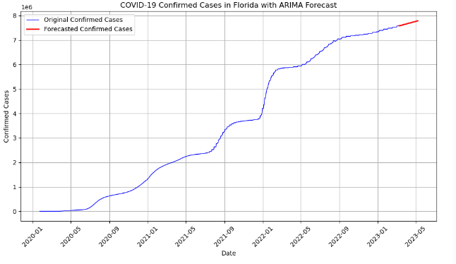
COVID-19 ARIMA Forecast

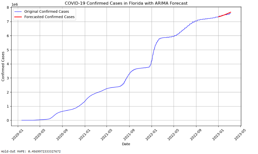
To further demonstrate the effectiveness of this model and enable a meaningful comparison, I modified the code to perform a Hold-Out MAPE calculation. In brief, the model initially uses all historical data to forecast future values, which we cannot confirm, evaluate, or measure for accuracy at this time. In time series analysis, given the importance of temporal alignment, performing a Hold-Out MAPE is a logical approach. For this calculation, I split the data, using observations from the beginning up to January 1st, 2023, for training. From January 2nd, 2023, until the latest available date, March 9th, 2023, I generate a forecast and compare the model’s predictions against actual observed values. After calculating both the Hold-Out MAPE and RMSE, these results can be reviewed in the results tab for evaluation.


train_end_date = '2023-01-01'
test_start_date = '2023-01-02'
test_end_date = '2023-03-09'

In this code, I implimented the testing, training, and how I am manipulating the current code to the MAPE necessity These dates are used to split the data for training model and defining that forecasting period.


training_data = fl_data.loc[:train_end_date, 'Differenced_Confirmed'].dropna()
model = ARIMA(training_data, order=(5, 0, 5))
forecast_steps = len(pd.date_range(start=test_start_date, end=test_end_date, freq="D"))
forecast_differenced = fit_arima.forecast(steps=forecast_steps)
last_observed = fl_data.loc[train_end_date, 'Confirmed']
forecast_original_scale = forecast_differenced.cumsum() + last_observed
forecast_dates = pd.date_range(start=test_start_date, periods=forecast_steps)
fit_arima = model.fit()

In this code, I implemented the testing, training, and how I am manipulating the current code to the MAPE necessity These dates are used to split the data for training model and defining that forecasting period.


training_data = fl_data.loc[:train_end_date, 'Differenced_Confirmed'].dropna()
model = ARIMA(training_data, order=(5, 0, 5))
forecast_steps = len(pd.date_range(start=test_start_date, end=test_end_date, freq="D"))
forecast_differenced = fit_arima.forecast(steps=forecast_steps)
last_observed = fl_data.loc[train_end_date, 'Confirmed']
forecast_original_scale = forecast_differenced.cumsum() + last_observed
forecast_dates = pd.date_range(start=test_start_date, periods=forecast_steps)
fit_arima = model.fit()

Here, I am preparing the current differenced dataset and making sure that it will work by dropping any missing values, so only valid points are included in the training set. Then, I run it through the ARIMA model and forecast.

ARIMA Forecast Hold-Out MAPE

After performing the Hold-Out MAPE, the result is 0.45%, which is a very low error accuracy. Then, for RMSE the result was 44,609.035.

Developed SARIMA Model:

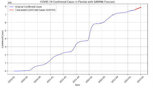
For this COVID-19 dataset, the SARIMA model extends ARIMA by incorporating seasonality. The mathematical expression of my SARIMA model is:

After performing the ARIMA model, it can be seen that the data would have been better fitted with a SARIMA model. SARIMA, an extension of ARIMA, also works with linear regression however takes into consideration of the complexity that seasonality can hold within our data. As it can be seen in the EDA, the data has a cyclical pattern. This is common within different epidemiology such as flu season, where there are times the data spikes and decreases as medical advances (in our case COVID-19 vaccines or leaving the winter season) can cause diagnosis of COVID-19 to increase or decrease.

Within the code we explored, the seasonal part of the SARIMA model would look like:

\[ Y_t = c + \phi_1 Y_{t-1} + \dots + \phi_p Y_{t-p} + \theta_1 \epsilon_{t-1} + \dots + \theta_q \epsilon_{t-q} + \Phi_1 Y_{t-s} + \Theta_1 \epsilon_{t-s} + \epsilon_t \]

Where:

Now, the main difference between the ARIMA and the SARIMA is the addition of the \( s \) term. When I was exploring the data, it was seen that the data had an upward trend throughout the whole set, but also the data temporally increased every 7 days. Therefore, I chose to have a weekly seasonality within the dataset. The comparison between these two models can be seen in the results tab.

The developed SARIMA model's code still stems from ARIMA, but the difference is the addition of the seasonality.


from statsmodels.tsa.statespace.sarimax import SARIMAX
sarima_model = SARIMAX(fl_data['Differenced_Confirmed'].dropna(), 
order=(5, 0, 5), 
seasonal_order=(1, 1, 1, 7))
fit_sarima = sarima_model.fit()
forecast_steps = 60
forecast = fit_sarima.forecast(steps=forecast_steps)
 
COVID-19 SARIMA Forecast

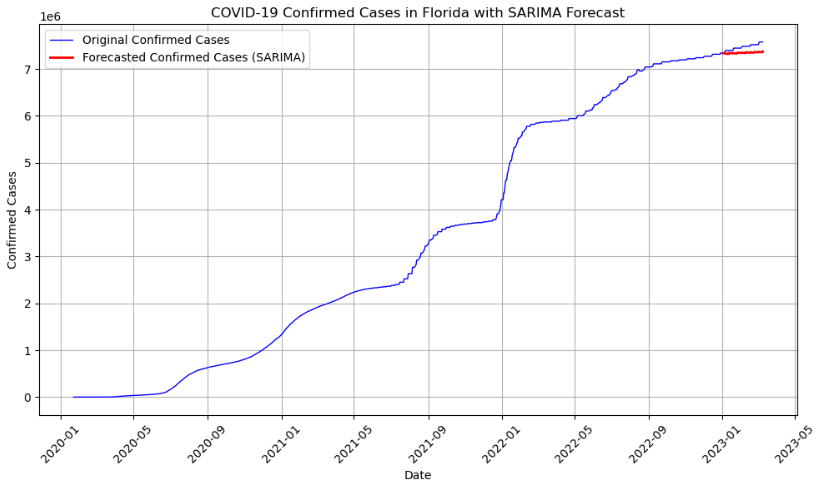
Similarly to before, I also did a hold-out MAPE analysis to the SARIMA code to get a critical analysis on the model’s strength on this dataset. I also used the same start and end dates as before for the training and the test data. The biggest difference is the application of seasonality in this model.


training_data = fl_data.loc[:train_end_date, 'Differenced_Confirmed'].dropna()
sarima_model = SARIMAX(training_data, order=(5, 0, 5), seasonal_order=(1, 1, 1, 7))
fit_sarima = sarima_model.fit()

forecast_steps = len(pd.date_range(start=test_start_date, end=test_end_date, freq="D"))
forecast_differenced = fit_sarima.forecast(steps=forecast_steps)

Here, we can clearly see the seasonal_order that is representing the weekly seasonality. Then, instead of ARIMA, it is ultilizing the SARIMAX function which performs the machine learning model given the training and test datasets. The results will be explained in depth in the results tab, but this model produced a Hold-Out MAPE of 1.61% and an RMSE of 132,247.95. Simply, the ARIMA model in this case performed significantly better than SARIMA.

COVID-19 Hold Out SARIMA Forecast

Bayesian Structural Time Series Model (BSTS)

The BSTS model can now be expressed as:

\[ Y_t = \phi_t + \Phi_t + X_t \beta + \epsilon_t\]

Where:

Similarly to before, the same John Hopkins data is processed into JupyterNotebook. The biggest difference between the BSTS and ARIMA is the use of a prior distribution and it does take into consideration trend and seasonality. So, taking those into consideration, I performed the following code:


trend_all = np.linspace(0., 1., len(florida_data))[..., None]
trend_all = trend_all.astype(np.float32)
num_forecast_steps = 7
trend = trend_all[:-num_forecast_steps, :]

In Bayesian analysis, it does take into consideration the trend of the data. So, this code helps create a synthetic trend based on the number of forecasts that I am indicating. In this case num_forecast=7, for a weekly trend. Because Bayesian analysis inherently relies on the prior data assumptions, this aids in serving as a prior for the trend of the data. I am implicitly giving the data the assumption that it will increase over time. I did this because based on the movement of the overall data over time, to me it does give the idea that it will.


seasonality_all = pd.get_dummies(florida_data.index.dayofweek).values.astype(np.float32)
seasonality = seasonality_all[:-num_forecast_steps, :]

This part of the code focuses on the seasonal component of the Bayesian model. Since we are still working with weekly data, it gives a prior that is attempting to capture a weekly seasonality as its expectation. The creation of the seasonality matrix provides a visual way that shows how the data is incorporated.

– COVID Seasonality, Trend

Here, the visualized seasonality demonstrates the priors implemented in the model: the assumed weekly pattern across days of the week and the increasing trend over the years.

After applying the priors of seasonality and trend to the data, I shift over to the overall movement of the data and how I want to fit the Bayesian model. Since I have an uninformed dataset, I am choosing to apply the Gaussian prior for the intercept, trend coefficient and seasonality coefficient.


@tfd.JointDistributionCoroutine
def ts_regression_model():
intercept = yield root(tfd.Normal(0., 100., name="intercept"))
trend_coeff = yield root(tfd.Normal(0., 10., name="trend_coeff"))
seasonality_coeff = yield root(
name="seasonality_coeff"))
noise = yield root(tfd.HalfCauchy(loc=0., scale=5., name="noise_sigma"))

In this code, the Gaussian priors are highlighted in the root(tfd.Normal(0., 100., name=) repetition. To explain further, this is a normal distribution with a mean of 0 and a large standard deviation of 100. This allows for significant flexibility with the intercepts to adapt to the dataset without heavily influencing the posterior toward any specific initial level. For the trend, it is similar but with a standard deviation of 10. This provides a moderate constraint, meaning that the data is still somewhat flexible, enabling it to capture trends without assuming strong or weak effects. The seasonality component has a standard deviation of 1. Since I am aware of the seasonality, this tight constraint keeps the component closely centered around 0, reinforcing the weekly seasonality mentioned before. Lastly, the Half Cauchy in the code is a function that is capturing the white noise in the function.

  
y_hat = (intercept[..., None] +
tf.einsum("ij,...->...i", trend, trend_coeff) + 
tf.einsum("ij,...j->...i", seasonality, seasonality_coeff)) 
    
yield tfd.Independent(
tfd.Normal(y_hat, noise[..., None]),
reinterpreted_batch_ndims=1,
name="observed"

In the second part of the function development, the code is showing how the predicted output is being developed (y_hat) based on the following: intercept, trend, seasonality. Then, it is taking these components and defining the likelihood distribution for the John Hopkins data.

COVID Bayesian Prior Distribution

This image shows the visualization of the prior predictive samples from the function. Each line represents one simulated time series drawn from the general priors defined by the Gaussian distribution and pre-set parameters.

Next, after our function is developed, I am going to create a training and testing data sets from the data. The training set will be all the data up until January 1st 2023, and then the test set is from January 2nd 2023 til March 9th 2023. This is because March 9th is the last recorded date that this dataset holds a confirmed case. So, although I have the data from Jan-March, to I want to see how the model will perform the hold-out MAPE.


model = sts.Sum(
components=[
sts.LocalLinearTrend(observed_time_series=florida_training_data),
sts.Seasonal(num_seasons=7, observed_time_series=florida_training_data)],
observed_time_series=florida_training_data)
variational_posteriors = tfp.sts.build_factored_surrogate_posterior(model=model)

The above code is setting up the variational inference, which is the built-in function in PyMC for the Bayesian STS. What this is doing is constructing the surrogate posterior, which is what is creating computational inferences in an optimal matter.

COVID Training Forecast, Bayesian COVID Training Forecast, Bayesian

The two images above show the original dataset and the predicted values for the testing dates. As we can see, the predictions are not perfect, but the trend is followed closely, and the data points are relatively accurate. After calculating MAPE and RMSE, the results were 0.380% for MAPE and 31,599.05 for RMSE.

Methods for CO₂ Emission Forecasting

In this part of my methodology, I will explain the following: the data cleaning process for the NOAA dataset, the development and application of the ARIMA/SARIMA model on this dataset, and finally, the BSTS model. These models will be compared in a later section of the capstone to evaluate their performance on this dataset.

Data Cleaning

I downloaded the Mauna Loa CO₂ dataset from the NOAA website (Mauna Loa CO₂ Data) because of its reliability and regular updates, which makes it perfect for time series forecasting. However, before I could use the data, I had perform some data preparations. At the top of the file, there was a description about the data and how it should be used, but it got read as part of the dataset, which messed up the column headers. I had to delete that section to get everything aligned correctly. The dataset also mentioned some missing days, which could throw off the averages if not handled carefully. This part was important to keep the data unbiased. Another issue was the gap caused by the Mauna Loa volcano eruption, which stopped data collection from November 29, 2022, to July 2023. I had to account for this gap during my analysis so it wouldn’t affect my results. Lastly, the data didn't have separate "Year" and "Month" columns, even though the information was included in the decimal date field. To make things easier to work with, I added those columns by extracting the year and month from the decimal dates. After these adjustments, the dataset was ready for analysis.

 
co2_data.rename(columns={'year': 'year', 'decimal date': 'decimal_date', 'Monthly Average of CO2': 'CO2'}, inplace=True)
co2_data['year'] = co2_data['decimal_date'].astype(int)
co2_data['month'] = ((co2_data['decimal_date'] - co2_data['year']) * 12 + 1).astype(int)
 

Here, I also renamed the columns of the data to be more explicit for the future coding process. Dataset also had the date in decimal format, so I made sure that the code makes it integer type for processing.

ARIMA/SARIMA Method:

To forecast CO₂ emissions, we first download the dataset from the NOAA Global Monitoring Laboratory website, where they monitor monthly CO₂ emissions at Mauna Loa. After downloading the dataset, I loaded it into a Jupyter Notebook for graphing and exploration.

Monthly Average CO2 Level + 1st ADF test

Initially, the graph of the CO₂ data showed both a seasonal pattern and an upward trend, suggesting that the data is non-stationary. To confirm this, I applied the Augmented Dickey-Fuller (ADF) test, which tests the following hypotheses:

Using a significance level of 0.05, if the p-value is less than 0.05, we reject the null hypothesis. In this case, as it can be seen, the p-value from the ADF test was 1, which is greater than 0.05. This indicates that the data is non-stationary, and stationarization is required.


  co2_data_diff = co2_data['CO2'].diff().dropna()
  dftest_diff = adfuller(co2_data_diff)
  dfoutput_diff = pd.Series(dftest_diff[0:4], index=['Test Statistic', 'p-value', '# Lags Used', 'Number of Observations Used'])
  for key, value in dftest_diff[4].items():
  dfoutput_diff[f'Critical Value ({key})'] = value
Differenced Monthly Average CO2 Levels +2nd ADF Test

In the provided code and output, the dataset is differenced and any missing values are dropped. Then, after differencing, the adfuller, or the ADF test is performed. The results are then subsequently printed.

After applying the differencing technique to the data, the Augmented Dickey-Fuller (ADF) test was re-conducted. The resulting p-value of 0.00005 provides strong evidence to reject the null hypothesis (\(H_0\)), confirming that the series is now stationary (\(p < 0.05\)).Next, I examined the Partial Autocorrelation Function (PACF) and Autocorrelation Function (ACF) plots derived from the differenced data. Based on these plots, two potential ARIMA models were identified: (3,1,2) and (3,1,1). I used Python's Statsmodels library to fit these models and selected the model with the lowest Akaike Information Criterion (AIC) value, which turned out to be the (3,1,2) model. This model was then used to forecast CO₂ emissions up to 2025. While the forecast captured the general upward trend, it did not represent the seasonality in the data.

ARIMA Forecast CO2

To address the seasonality, I applied a Seasonal ARIMA (SARIMA) model. Using the same non-seasonal order (3,1,2), I added a seasonal order of (1,1,12) to account for the monthly seasonality. After fitting the SARIMA model and forecasting 60 steps ahead, the resulting forecast captured both the trend and the seasonality of the data, providing a more accurate projection.

Given the specified parameters from the AIC model, (3,1,2), it is now possible to mathematically represent our ARIMA model with the following:

\[Y_t = c + \phi_1 Y_{t-1} + \phi_2 Y_{t-2} + \phi_3 Y_{t-3} + \theta_1 \epsilon_{t-1} + \theta_2 \epsilon_{t-2} + \epsilon_t\]

Where:

The AR part includes three lags, \( \phi_1 \), \( \phi_2 \), \( \phi_3 \). And the MA part contains two past errors, \( \theta_1 \), \( \theta_2 \). Then, the differencing allowed there to be an impact on the \( d \) term.

Now, this ARIMA model, perhaps due to this dataset being significantly smaller, has not captured the seasonality as appropriately. From here I applied a Hold-Out MAPE on the data. To do this, I had to create a training set and test set from what is already known, to see how the model would perform.


train_start, train_end = '2020-01', '2023-12'
train_data = co2_data.loc[train_start:train_end, 'CO2']
train_data_diff = train_data.diff().dropna()
model = ARIMA(train_data_diff, order=(3, 1, 2))
fit = model.fit()
forecast_end_date = '2024-09'
forecast_steps = len(pd.date_range(start=pd.to_datetime(train_end) + pd.DateOffset(months=1), end=forecast_end_date, freq='MS'))
forecast_diff = fit.forecast(steps=forecast_steps)

As it was seen before with the COVID dataset, we take all the historical data up to December 2023, and then from January 2024 until September 2024, the data is then simulated based on the model and how it performs. With this, the comparison between what was generated or assumed is tested against what occurred.

– CO2 ARIMA MAPE

When comparing the blue original data against the ARIMA forecast, it can be seen that it is not the most perfect simulation of future data. This is also seen by the results as the RMSE is 3.34 and Hold Out MAPE is 0.64%.

This will be continued to be explored in the results tab. However, this is why it is important to consider the SARIMA in this case as well.

To address the seasonality, I applied a Seasonal ARIMA (SARIMA) model. Using the same non-seasonal order (3,1,2), I added a seasonal order of (1,1,12) to account for the monthly seasonality. After fitting the SARIMA model and forecasting 60 steps ahead, the resulting forecast captured both the trend and the seasonality of the data, providing a more accurate projection.


from statsmodels.tsa.statespace.sarimax import SARIMAX
sarimax_order = (3, 1, 2)
seasonal_order = (1, 1, 1, 12)  # Monthly seasonality
model = SARIMAX(co2_data['CO2'], order=sarimax_order, seasonal_order=seasonal_order)
fit = model.fit(disp=False)
SARIMA Forecast CO2

Again, similar code was generated to create a Hold-Out MAPE analysis with the SARIMA model as well. The only change is that this code takes into account the seasonality that the SARIMA model captures, unlike the ARIMA.

SARIMA Forecast CO2

This shows that the original data and the forecasted does line up closer than the ARIMA's set. This will be explained more in the results, but the outcome of this data and its performance was that the RMSE was 0.97 and the Hold-Out MAPE was 0.21%.

Bayesian STS Methods:

After the general data cleaning as referenced above, I originally attempted to use the PyMC3 library, but it was outdated. Instead, I used PyMC and TensorFlow Probability (TFP), both of which support Bayesian modeling methods. TFP offers a lower-level API but requires additional shape handling, as seen in the code through the use of .numpy() and .squeeze() when defining the time series model.


    file_path = r"C:\Users\gesua\Documents\Capstone_Project\Capstone\co2_mm_mlo.csv"
    co2_data = pd.read_csv(file_path)
    co2_data.rename(columns={'year': 'year', 'date_month': 'month'}, inplace=True)
    co2_data['date'] = pd.to_datetime(co2_data[['year', 'month']].assign(day=1))
    

This code emphasizes the data cleaning process. After importing, the columns are renamed to year, month, and date for consistency. Then, the data is processed into a datetime format, which enables easy plotting of atmospheric CO2 levels over the years.

Graph of atmospheric CO2 levels over the years

The graph visualizes the seasonality pattern alongside the trend across the time series data. The seasonality is represented by the periodic shifts seen diagonally, indicating repeating monthly cycles (e.g., January through December). This diagonal pattern emerges from transforming the time data into a cyclic sequence, such as [1, 2, 3, ..., 12, 1, 2, ...]. In the design matrix, these cycles become evident, helping capture recurring patterns year-over-year.

The trend component, on the other hand, models the general direction of the data over time, reflecting the increase in CO2 levels. By combining the seasonal pattern with the trend, this visualization lays the foundation for the time series regression model. Specifically, in the code, the dummy variables capture these seasonal effects, and the relationship is modeled using a linear regression framework with a likelihood of \(Y \sim N(X\beta, \sigma^2)\). As part of the Bayesian model, Gaussian priors are incorporated, allowing for more robust inference as the model develops.

Graph of Seasonality and Trend of the Data

After the visualizations, I used the prior predictive samples from the simple regression model as graphed in the beginning. Aith this, we now define the following function in python:

intercept = yield root(tfd.Normal(0., 100., name="intercept"))

This represents the intercept baseline of the time series, where we are modeling with the Gaussian prior, centered at 0 with a large standard deviation (in this case, 100) to allow flexibility within the timeseries. Because I do not have previous knowledge on the timeseries, I am attempting to make a model that is flexible that will cover the data.


    trend_coeff = yield root(tfd.Normal(0., 10., name="trend_coeff"))
    seasonality_coeff = yield root(tfd.Sample(tfd.Normal(0., 1.), sample_shape=seasonality.shape[-1], name="seasonality_coeff"))
    noise = yield root(tfd.HalfCauchy(loc=0., scale=5., name="noise_sigma"))
    

This code is capturing the seasonality, trend, applying shape and structure to the model definiton. The sample_shape is applying the 12 month seasonality, and the Half-Cauchy distribution is accounting for the noise, or randomness of the data. This also is ensuring that the variance remains positive.

After this, the observed likelihood is defined with the normal distribution with an ensured independence in the observations. This is implimented with tfd.independent.

Next, sampling the priors can be seen with the graph below.

Graph of Priors

Prior predictive samples from the simple regression model for the monthly CO2. Each line is one simulated time series, and they were uninformative priors, as they did not stem from the data set originally, but were applied general priors to follow with Gaussian distribution and are pre-defined parameters.

Next, I developed code for the actual forecast. Which can be highlighted with the following code:

 
train_end_date = '2023-12'
co2_training_data = co2_data.loc[:train_end_date, 'Monthly Average of CO2'].values.astype(np.float32)
dates_train = co2_data.index[:len(co2_training_data)]
co2_testing_data = co2_data.loc['2024-01':'2024-09', 'Monthly Average of CO2'].values.astype(np.float32)
dates_test = co2_data.index[len(co2_training_data):len(co2_training_data) + len(co2_testing_data)]

First, I have to prepare the training and test data. To summarize, training data is going to be the data that is used to highlight the historical data, and the testing data is defining the timeframe from January 2024 to September 2024. These dates are important since I am applying hold-out MAPE to compare optimization of the model.

model = 
  sts.Sum(
  components=
  [
  sts.LocalLinearTrend(observed_time_series=co2_training_data),
  sts.Seasonal(num_seasons=12, observed_time_series=co2_training_data)
  ],
  observed_time_series=co2_training_data)

This code defines the BSTS model, seen by the LocalLinearTrend and the seasonal component. Since this is monthly data, there is a seasonality of 12 months to model the dataset. These two help the model to stretch the forecast into the future as it highlights the long-term trends and the seasonality variations.

 
variational_posteriors = tfp.sts.build_factored_surrogate_posterior(model=model)
optimizer = tf.optimizers.Adam(learning_rate=0.1)
tfp.vi.fit_surrogate_posterior(
target_log_prob_fn=model.joint_log_prob(co2_training_data),
surrogate_posterior=variational_posteriors,
optimizer=optimizer,
num_steps=200
)

Variational surrogate posterior (or also known as Variational Inference) is used to cast an approximation on Bayesian inference for optimization. This shows the power of the TensorFlow Probability library as it seeking a 'surrogate' posterior and minimizes the KL divergence. In my code, it is approximating the posterior distribution of the model parameters. Then, using the Adam optimizer is being used to find the "best-fit" parameters.

 forecast_dist = tfp.sts.forecast
  (
    model=model,
    observed_time_series=co2_training_data,
    parameter_samples=variational_posteriors.sample(50),
    num_steps_forecast=9
  )
forecast_mean = forecast_dist.mean().numpy().squeeze()
forecast_index = pd.date_range(dates_train[-1] + pd.DateOffset(months=1), periods=9, freq="M")
 

Finally, I am able to now forecast the next 9 months using the posterior samples that came from the VI, and thden generates the mean forecast and dates for the future months. After this, the following data was plotted and the outcome shows that the model predictions match the actual date of the data.

Graph of Priors

Results

COVID-19

In this section, I review the COVID-19 dataset using ARIMA, SARIMA, and BSTS models to evaluate their performance, compare the original data to the forecasted data, and highlight key results. I assess these models by examining their RMSE and Hold-Out MAPE values on the respective datasets.

First, I generated results based on the training and testing data, forecasting a known future and comparing the results to the actual data. In the COVID-19 dataset, the forecasted period spans from January 2, 2023, to March 9, 2023. I then overlapped the forecasted data with the real data, which ranges from 2020 to March 9, 2023. Finally, I applied code to evaluate the accuracy of the real and predicted values using RMSE and MAPE.

To better understand the results, I will reintroduce RMSE and Hold-Out MAPE, as these measures highlight the strengths of our chosen models and aid in comparison. RMSE, or Root Mean Squared Error, indicates how much the model's predictions deviate from observed values. Hold-Out MAPE, or Mean Absolute Percentage Error, provides a measure of prediction accuracy based on the actual values. For both measures, the model with the lowest RMSE and Hold-Out MAPE is considered the best fit for the dataset. Higher RMSE values might initially seem concerning but given that I am analyzing data with tens or hundreds of thousands of cases, large RMSE values are expected and do not necessarily imply poor model performance. Since the main difference between ARIMA and SARIMA is the noisiness that is added into the model because of the explicit seasonality in the model, it is important to note that it made a difference in this dataset.

 COVID Bayesian Forecast

To highlight strengths and weaknesses, the BSTS model produced the lowest RMSE at 31,599.055 and the lowest Hold-Out MAPE at 0.380%, suggesting it is the most effective model for capturing data seasonality and trends. However, ARIMA, although it lagged behind BSTS, yielded results closer to it than SARIMA. SARIMA performed the least efficient out of the three in this dataset. This distinction is important because, despite its high accuracy, the BSTS model is computationally intensive and time-consuming. In contrast, simpler models like ARIMA and SARIMA run more quickly, with ARIMA demonstrating both speed and efficiency in its results.

 COVID ARIMA MAPE  COVID SARIMAX MAPE

Another important aspect of the ARIMA and SARIMA models could be how sensitive that the models are the their parameters. Since the model was tuned to /(5,0,5)/ in this case, it does not mean that there could have been an even better assortment of parameters that exist if the date/time was more specific, or if there was a better optimizer for the results. Then, the SARIMA was servely underestimated which can be seen with the predicted data falling severly below the existing data.

NOAA CO₂ Emissions

In this section, I review the NOAA dataset using ARIMA, SARIMA, and BSTS models to evaluate their performance, compare the original data to the forecasted data, and the highlighted results. I am assessing these models similarly to the COVID-19 models, by examining their RMSE and Hold-Out MAPE values on the dataset.

To perform the evaluations, I first split the data into training and testing sets, then developed a forecast that could be validated. I divided the data based on time, using data from January 2020 to December 2023 for the training set. The forecast targeted data from January 2024 to September 2024, as this is the most recent data accessible on the NOAA website at the time of this paper. This process was further detailed in my methods section. The following images show the predicted forecast and how it visually compares to the actual data.p> training data, forecast, actual data graph

The model that performed the best was the BSTS model, with an RMSE value of 0.765 and a Hold-Out MAPE of 0.161%. The predicted CO₂ mole fraction (ppm) range is increasing by the hundreds, unlike the COVID-19 data, which increased by the hundreds of thousands. This explains why the RMSE value is much smaller for this dataset. In this case as well, a smaller RMSE indicates better model performance. Similarly, the BSTS model had the lowest Hold-Out MAPE among all three models, suggesting that it is the most suitable for forecasting in this dataset.

To summarize the performance of the three models on this dataset, the SARIMA model performed significantly better this time, as indicated by RMSE and Hold-Out MAPE values that were close to those of the BSTS model. It is interesting to see how well the SARIMA model performed in this case, as it is less computationally expensive and reliable. ARIMA, on the other hand, did not perform as well as the other two models.

 CO2 ARIMA MAPE  CO2 SARIMAX MAPE

Another reason why BSTS and SARIMA could have outperformed the ARIMA model could be because of the nature of CO₂ data. It typically has a strong seasonality, which was enhanced with the dummy seasonality in the BSTS code, and it has a strong trend. SARIMA also captures true seasonality nicely compared to ARIMA. Overall, this type of analysis and application to CO₂ forecasts is important to many policies and environmental as accurate CO₂ forecasts can help policymakers anticipate seasonal peaks in emissions and implement timely interventions.

Discussion

The Bayesian model emerged as the stronger performer across these datasets, though it comes with some challenges. One significant drawback is that it is computationally expensive and takes a long time to load and process data, which can be frustrating during model development. Both datasets used in this study were non-stationary, and the way this was handled differs between ARIMA and Bayesian Structural Time Series (BSTS) models. I suspect that this difference may have contributed to ARIMA's low performance. It raises the question of how ARIMA would have performed had the data been transformed differently or more thoroughly stationarized before modeling. Looking ahead, it would be interesting to explore how the results might change by incorporating more informed priors into the Bayesian model. This could improve the model's predictive power and provide more meaningful insights. While ARIMA is simpler to understand and easier to implement, careful model selection remains crucial. With large datasets, relying on automatic parameter selection (like Statsmodels' choice of (p, d, q)) may not always yield the most efficient or effective results, which highlights the importance of thoughtful tuning and testing in the modeling process.

Aside from the model performances,

Future Directions

Doing this project has taught me a significant amount of information on the differences between Bayesian and traditional time series analysis models. In the future, I would try and apply deep learning techniques like LSTM to see if it performs as well or better than the BSTS models that I had created before. The goal would be to see if different models that apply stronger computational power and functions would yield even greater results, and be close to if not exactly the same predicted outcomes. Another concept would be to create hybrid models that combine traditional models like ARIMA/SARIMA and deep learning like LSTM or Gradient Boosting. The goal of this would be to capture both the linear and non-linear patterns within a model to enhace accuracy. Additionally, looking at different variables in the COVID-19 dataset, like socioeconomic factors or environmental factors, to add to the modeling of the forecast. These are some directions that this project could continue to go in, if I were to continue.

Project Presentation

References